
Executive Summary
After analyzing the typographic frameworks of the UK (GDS), Canada, Singapore, the UAE, and Italy, below are the key strategic patterns observed across these diverse ecosystems:
- Font Selection & Inclusivity: Whether opting for open-source or bespoke typefaces, the primary driver must be functional clarity and WCAG-compliant accessibility across all user touchpoints.
- Scalable Type Scales: Establish a solid baseline font size first, then utilize
remunits for the entire scale. This ensures fluid responsiveness, allowing the interface to adapt seamlessly to user-defined browser settings. - Precision in Vertical Rhythm: Prioritize unitless values for line height to ensure proportional scaling.
- Font Weight Distribution: Limiting font-weight options not only clarifies information hierarchy but also optimizes performance by reducing web font loading overhead.
Why Typography is the Foundation of Government Design System
Imagine a user landing on a government website interface: they aren’t there to admire the UI; they’re there to consume information. In modern digital products, especially in government digital platforms, typography isn’t just a stylistic choice; it’s a high-performance tool designed to deliver information with speed, comfort, and precision.
- Readability & Usability: Optimize font scales and line heights to minimize cognitive load, ensuring users scan and digest information without friction.
- Accessibility (A11y): Implement relative units (e.g.,
rem) and WCAG-compliant contrast to ensure an inclusive experience across all devices and visual needs. - Systemic Consistency: A unified typographic scale acts as the “Single Source of Truth,” building user trust through a cohesive and professional brand voice.
Ultimately, typography in a Design System isn’t a collection of random styles. It is a rigorously tested framework of technical guidelines built to optimize reading efficiency and clarity for every single user.
How Important is Typography?
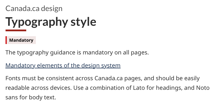
The Canada.ca Design System categorizes typography as a “Mandatory” element. This means adherence to defined typographic standards isn’t optional. It is a strict requirement for every single page within the ecosystem to ensure institutional clarity and compliance.
Font Family
Choosing a font-family for a government Design System is a high-stakes decision. It requires a delicate balance between readability, WCAG compliance, and licensing sustainability.
Global Font Strategies
Each government’s choice reflects its unique design philosophy, ranging from custom-built identities to universal open-source reliability:
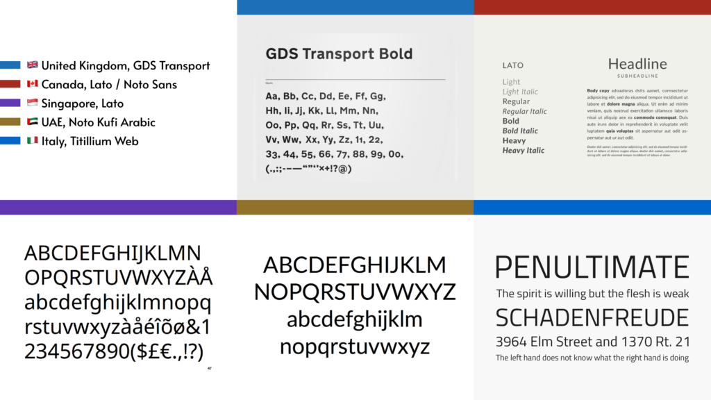
- The Custom-Built Fonts: Governments like the UK (GDS Transport), Italy (Titillium Web), and the USA (Public Sans) have engineered proprietary or highly customized typefaces. This move secures a unique “Brand Voice” for their government.
- The Open-Source Fonts: Canada and Singapore use Lato and Noto Sans. By leveraging the Google Fonts ecosystem, these systems ensure maximum compatibility across devices and zero licensing friction for cross-agency adoption.
- Multilingual Resilience: The UAE defined a dual-system approach, pairing Noto Kufi Arabic with Roboto/Inter, ensuring that bi-directional reading flows (RTL/LTR) feel cohesive and inclusive.
- Specialized Functional Typography: Both the USA and Italy include Functional Monospaced fonts (like Roboto Mono) for data-heavy displays and Auxiliary Serif fonts (like Merriweather or Lora) specifically optimized for long-form editorial reading on screens.
Emerging Patterns in Global Design Systems
- The Sans-Serif Default: There is an overwhelming shift toward Sans-serif fonts (e.g., Public Sans, Noto Sans) for digital interfaces. Their lack of decorative “feet” allows for cleaner rendering at small sizes on mobile screens.
- Noto Sans: The Noto Sans family is the global “go-to” for multilingual support (used by Canada, and the UAE) due to its mission of eliminating missing character boxes across diverse scripts.
- Robust Font Stacks: While the UK lists specific fallbacks like Helvetica and Arial, most modern systems now use System Font Stacks (
-apple-system,sans-serif) to ensure the fastest possible load times by leveraging fonts already installed on the user’s device.
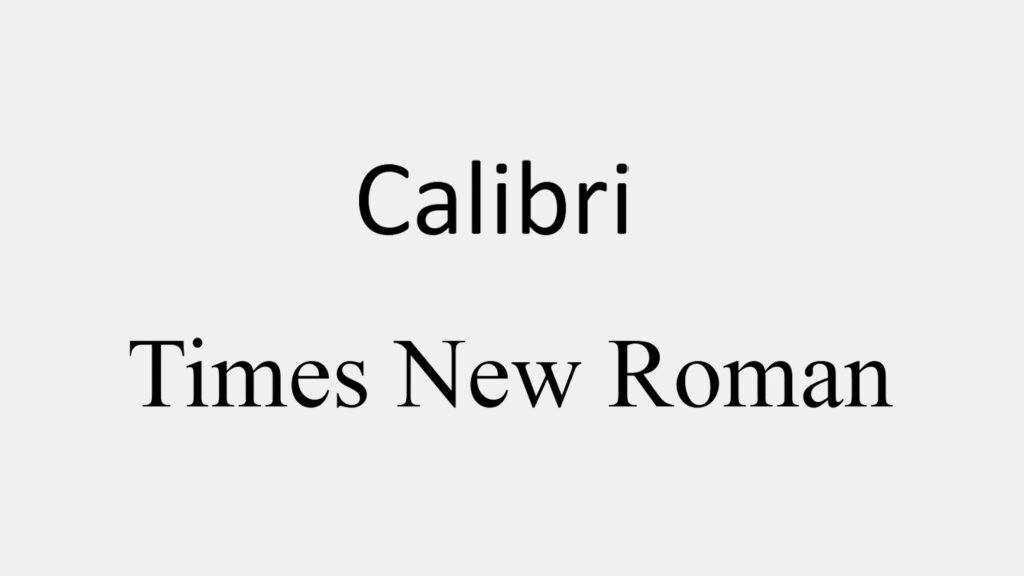
Brand Trust vs. Accessibility: The US State Department Case
In December 2025, Secretary of State Marco Rubio ordered a return to Times New Roman for official documents, aiming to restore a sense of “tradition and authority.”
The Design Conflict
- The Argument for Authority: Times New Roman carries an institutional gravitas that modern sans-serif fonts often lack in formal diplomacy.
- The Accessibility Gap: Design experts warned that this serif font, originally optimized for print, creates higher cognitive load and poorer legibility for low-vision users on digital screens.
The Takeaway: This tension highlights the ultimate Design System challenge: Identity vs. Inclusivity. While the department prioritized “Brand Trust” for physical paper, the decision remains a controversial benchmark for modern digital accessibility.
Font Size
Font size is a critical foundation for accessibility and responsive performance. It’s about how text adapts across viewports while maintaining a comfortable baseline for every user.
Two Paths to Scalability
When defining font scales, modern government design systems typically follow one of two strategic directions:
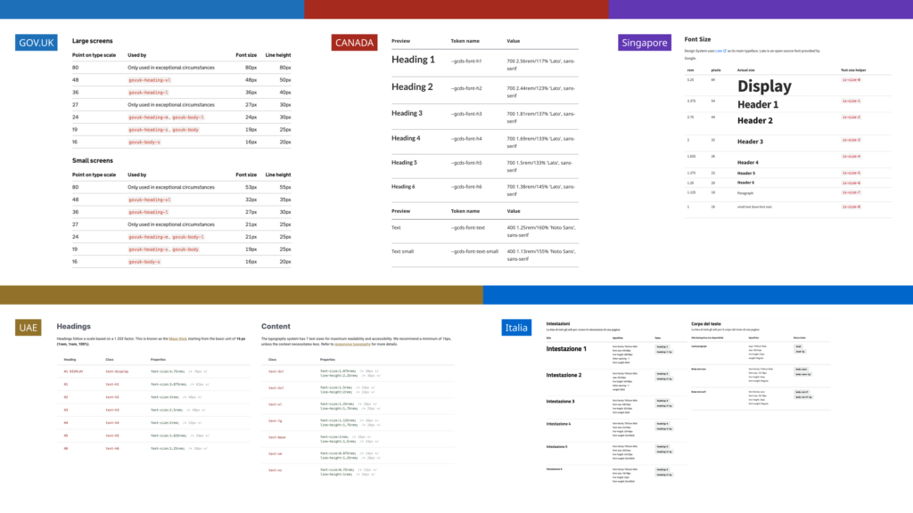
- The Accessibility-First Approach: Systems like UK’s GDS (19px) and Canada.ca (20px) are increasing baseline sizes to prioritize inclusivity. By deprecating smaller sizes (like the UK’s removal of 12px), they streamline design decisions, reducing friction for designers by eliminating unnecessary choices.
- The Framework-First Approach: Conversely, systems like Singapore (Go.gov.sg) or UAE’s Design System often align with industry standards like Tailwind CSS or Bootstrap. By adopting a
16pxbase and standard modular scales, these systems prioritize developer velocity and ecosystem compatibility.
Technical Implementation: The rem Standard
To ensure users can scale text via browser settings without breaking the layout, industry leaders rely on relative units:
- Respect the Root: Keep the browser default root at 16px.
- Define the Baseline: Set your primary body size (e.g., UK’s GDS 19px).
- Convert to
rem: Translate design pixels into code.- Formula: 19px / 16px = 1.1875rem
Key Considerations for Your Type Scale
- Reading Context
- Does your service prioritize long-form policy reading (requiring a larger, comfortable baseline) or data-heavy dashboards (requiring smaller baseline and high information density)?
- System Compatibility
- Will you prioritize a bespoke scale to establish a unique, authoritative brand identity, or adopt a standardized scale (like Tailwind) to maximize developer velocity and ecosystem alignment?
- Mobile Fluidity
- Does your scale maintain hierarchy on small screens, or do your larger headings become unwieldy and broken on mobile viewports?
Line Height
Line height is the invisible scaffolding of government platforms. It dictates how fluidly a user’s eye moves from one line to the next. Get it right, and your content feels effortless; get it wrong, and you create a “wall of text” that spikes cognitive load.
In analyzing global design systems, I’ve found that the choice of units (px, %, or unitless) is rarely accidental. it represents a deliberate trade-off between precision and flexibility:
Fixed Pixels (px) for Absolute Control
Systems like the UK (GDS) and Italy often use fixed pixels to force text into a strict Vertical Rhythm. This ensures every line aligns perfectly with a baseline grid, prioritizing visual order and structural alignment over fluid scaling.
Percentages (%) and rem for Traditional Scaling
Canada.ca explicitly uses a 160% (1.6) ratio for body text. This is a deliberate choice for readability; it provides the optimal breathing room required for long-form government documents, minimizing eye strain for users.
Unitless Values for Universal Accessibility
The UAE system adopts unitless values (e.g., 1.5). This is the most robust approach for accessibility because it functions as a multiplier. No matter how much a user increases their font size in the browser, the line height scales proportionally without crashing into the line above—ensuring WCAG compliance at any zoom level.
Font Weight
In digital interfaces, font weight is no longer just “Light” or “Bold”. It is a standardized numeric system ranging from 100 to 900. This precision allows us to engineer a clear Information Hierarchy, ensuring that critical messages stand out while long-form content remains readable.
Three Strategic Archetypes
By analyzing global government systems, I’ve categorized their font-weight strategies into three distinct patterns:
- The Minimalist Binary (UK, Japan, Canada, Singapore): These systems prioritize simplicity by strictly adhering to a 400 (Regular) / 700 (Bold) split. By limiting choices, they eliminate design debt and ensure consistent rendering across all legacy devices.
- High-Contrast Emphasis (UAE, Italy): To create a more modern, editorial feel, these systems utilize extreme weights. The UAE and Italy employ 800 (Extra Bold) for headings, providing a powerful visual anchor. The UAE even offers a 400/600 toggle for body text, giving designers a “Medium” weight to highlight key information without the heaviness of a full Bold.
- Contextual Flexibility: Systems like the UK and UAE provide explicit guidelines on when to elevate weight within a paragraph—ensuring that emphasis is used purposefully to guide the user’s eye, rather than just for decoration.
Conclusion
When architecting typographic standards for a Design System, there is no universal “right answer”—only the optimal solution tailored to government specific context, user base, and linguistic nuances.
By analyzing the diverse frameworks of global digital governments, my goal is to provide a comprehensive reference for the Taiwan Government (PDIS). This research serves as a foundation to refine our own typographic rules, ensuring they are as inclusive, resilient, and user-centric as the world-class systems that inspired them.
References